
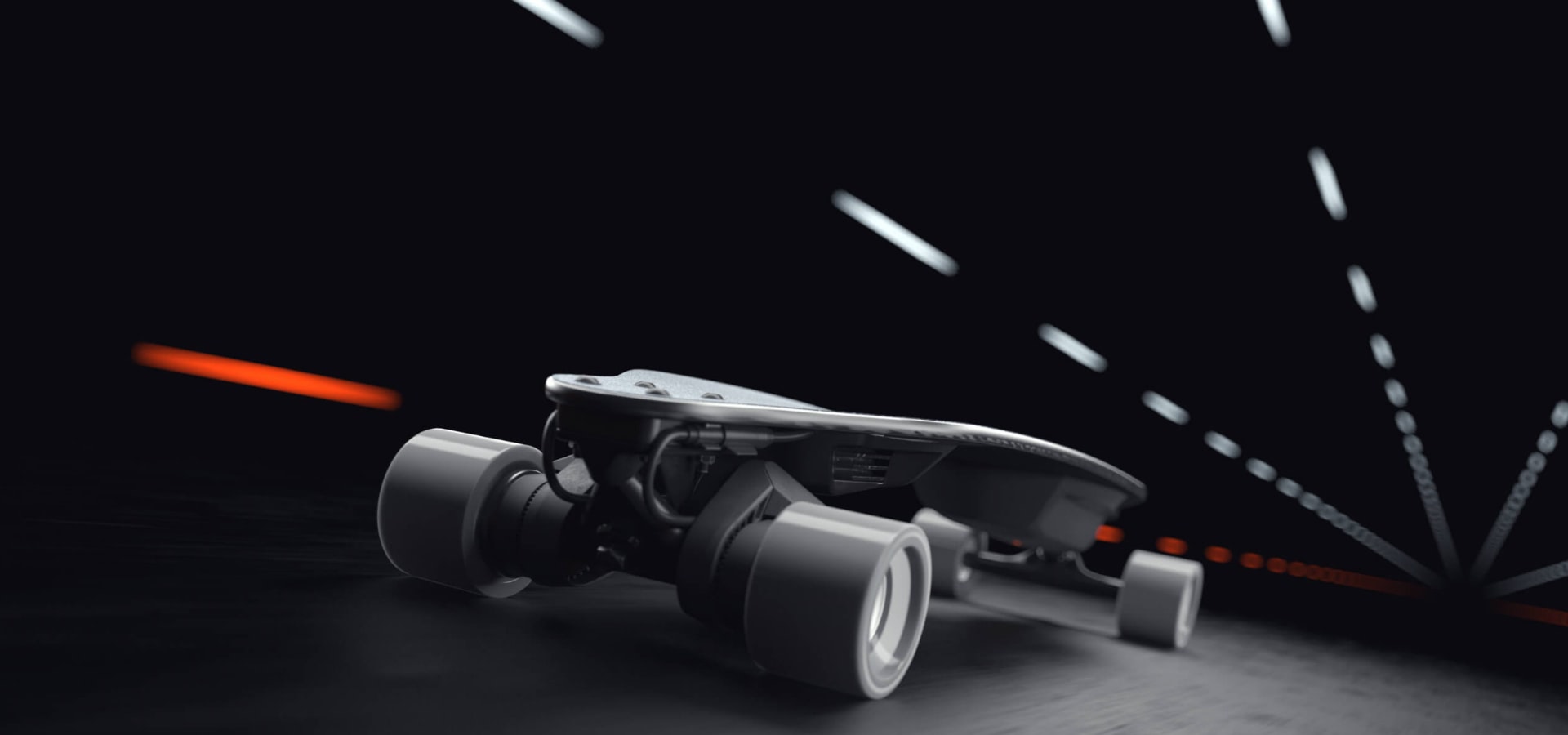
BoostedBoards Inc
.Product Experience Design
San Francisco, CA USA
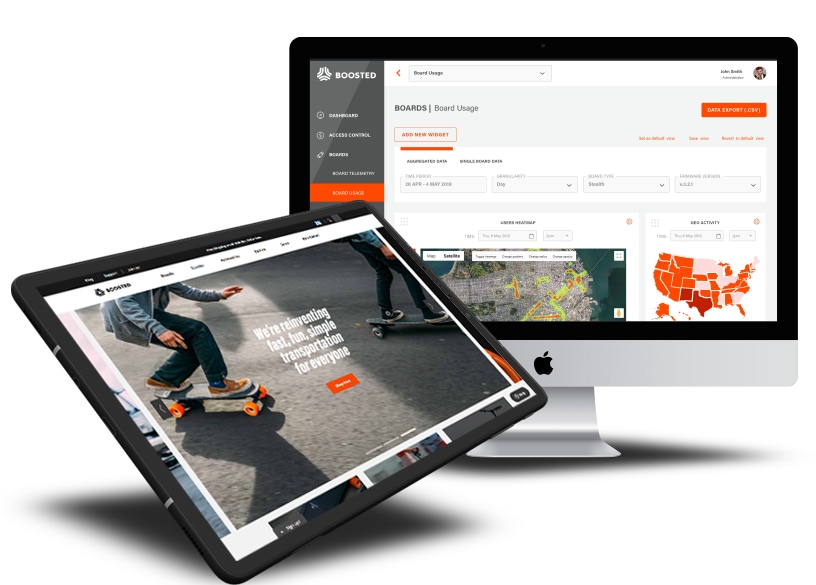
A connected digital experience for riders, devices, and the Boosted ecosystem.
I was lucky enough to work with the good people at Moment to explore ways to improve booking trips on their travel site.
What was the request
The overall design should be clean, modern, and intuitive, with clear navigation and user-friendly forms. The color scheme should be neutral and professional, with pops of color used to emphasize important information and highlight key features.
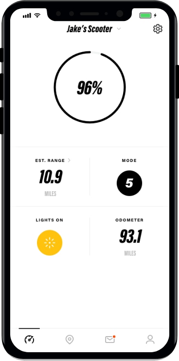
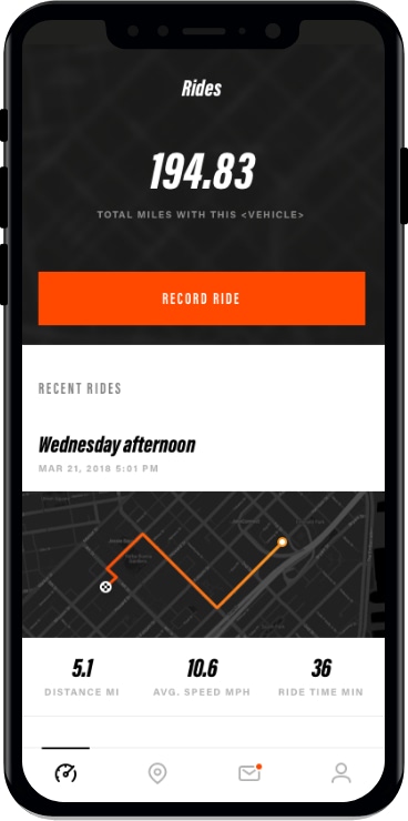
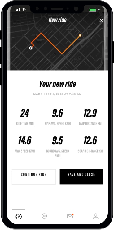
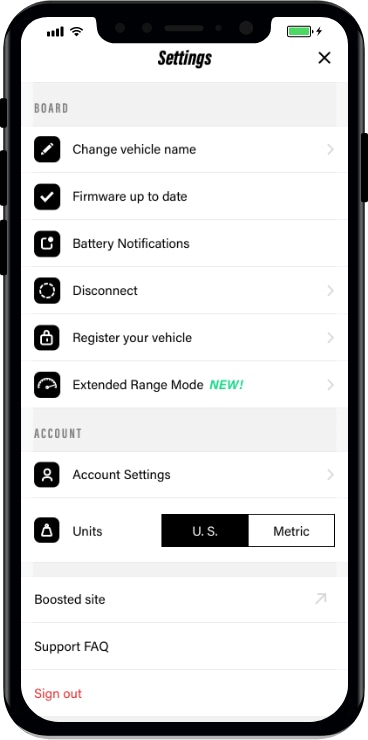
Device mobility and connectivity
The overall design should be clean, modern, and intuitive, with clear navigation and user-friendly forms. The color scheme should be neutral and professional, with pops of color used to emphasize important information and highlight key features.
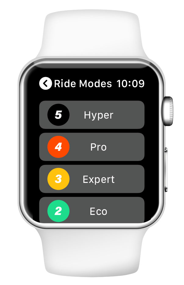
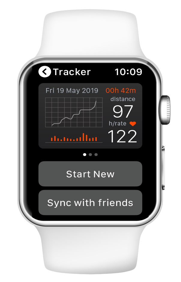
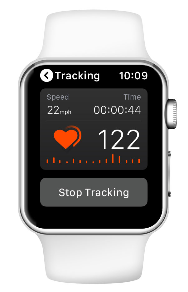
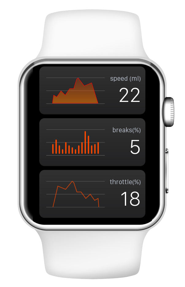
Flow Chart Architecture
These icons could be used in combination with each other and with text to create a cohesive and recognizable brand image for the medical case. The overall design should have a clean, modern look with clear lines and a minimalist color palette, evoking a sense of trust and professionalism.
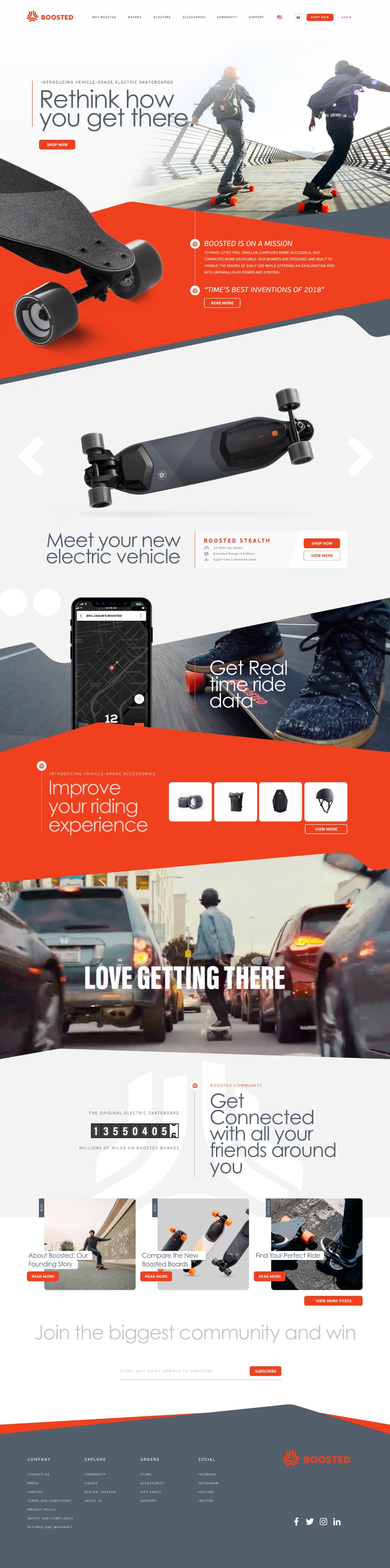
iPad Application
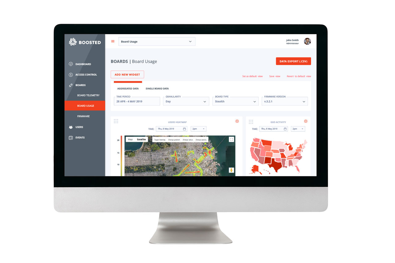
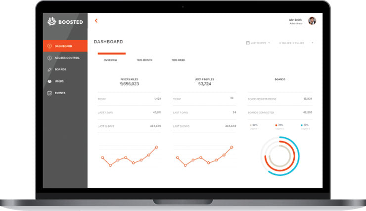
The overall design should be clean, modern, and intuitive, with clear navigation and user-friendly forms. The color scheme should be neutral and professional, with pops of color used to emphasize important information and highlight key features. A dashboard displays a summary of appointments and results, with forms for collecting results, scheduling appointments, reminders, and automated result notifications.
Credits
- Year:
- 2015
- Client:
- BoostedBoards Inc
- Location:
- San Francisco, CA USA
- Services:
- Product Experience Design, UX Research, Prototyping, UI Design, Flow Architecture
Services
- Prototyping
- UI Design
- Art Direction
- Branding
- Illustration